.png)


Getting Started
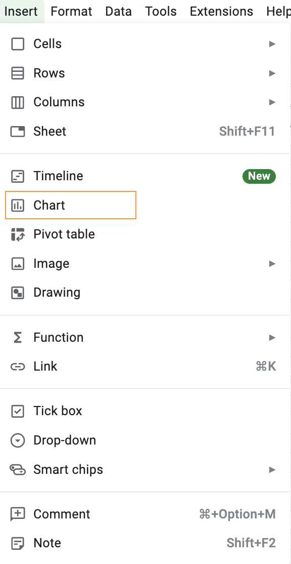
The first step in creating a Chart in Google Sheets is to select the data you want to display. You can do this by highlighting the range of cells containing the data you want to use. Once you’ve selected your data, click the Insert tab at the top of the page and select the type of Chart you want to create. Google Sheets offers a variety of Chart types, including line, bar, area, and pie charts.
Configuring Your Chart
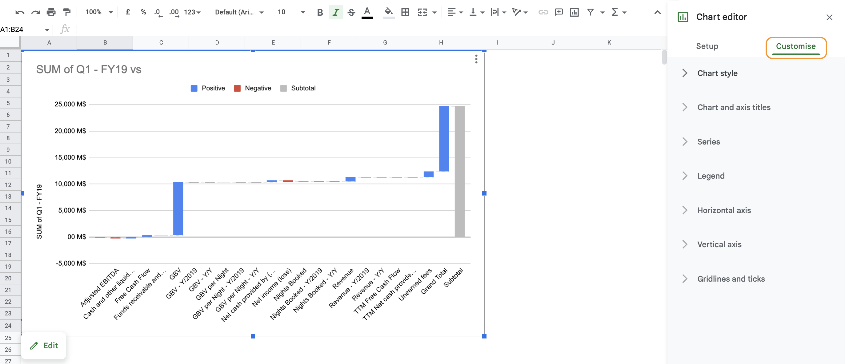
When building a Chart, it is important to make its visualization clear to yourself and your audience. Go for data visualization types that are straight-forward to understand in terms of trends and effective in terms of takeaways. Once you’ve chosen the type of Chart you want to create, you’ll need to configure it. To do this, click the “Customize” tab on the right side of the Chart window. Here, you can adjust the Chart’s title, labels, and other settings to get it to look exactly the way you want.

Formatting Your Chart
After configuring your Chart, you can then start to format it. You can do this by clicking the “Customise” tab on the right side of the Chart window. Here, you can change the font, color, size, and other settings to make your Chart look more professional.
Adding a Legend
For the sake of clarity, and with the idea of facilitating your own analysis and your readers’ understanding, it is important to add information that complements your charts. If you’re creating a Chart with multiple data sets, you may want to add a legend to make it easier for people to understand what each line of a bar represents. To add a legend, simply click on the “Legend” tab on the right side of the Chart window and select which data sets should be included.
Conclusion
Creating Charts in Google Sheets is a great way to make your data easier to understand and visualise. It is a must to really understand your data sets and narrow your analysis focus. By following the steps outlined above, you can easily create beautiful and professional-looking Charts in no time. With a bit of practice, you’ll soon be creating stunning Charts that will make your data stand out from the crowd!


.png)